 fargo
1a822493ba
fargo
1a822493ba
963 markdown files reformatted with the repository's pinned prettier so
pnpm format:check covers the folded tree like every other repo file.

The formatter's embedded-language pass also normalized code fences
(TS semicolons, closed HTML tags in examples, lowercased CSS hex colors,
one renumbered list that skipped an index). Alphanumeric token deltas vs
the fold commit were audited file-by-file; all are formatter-equivalent
markup normalizations plus the four sanitized skills.
1.3 KiB
1.3 KiB
category
| category |
|---|
| Browser |
useScreenSafeArea
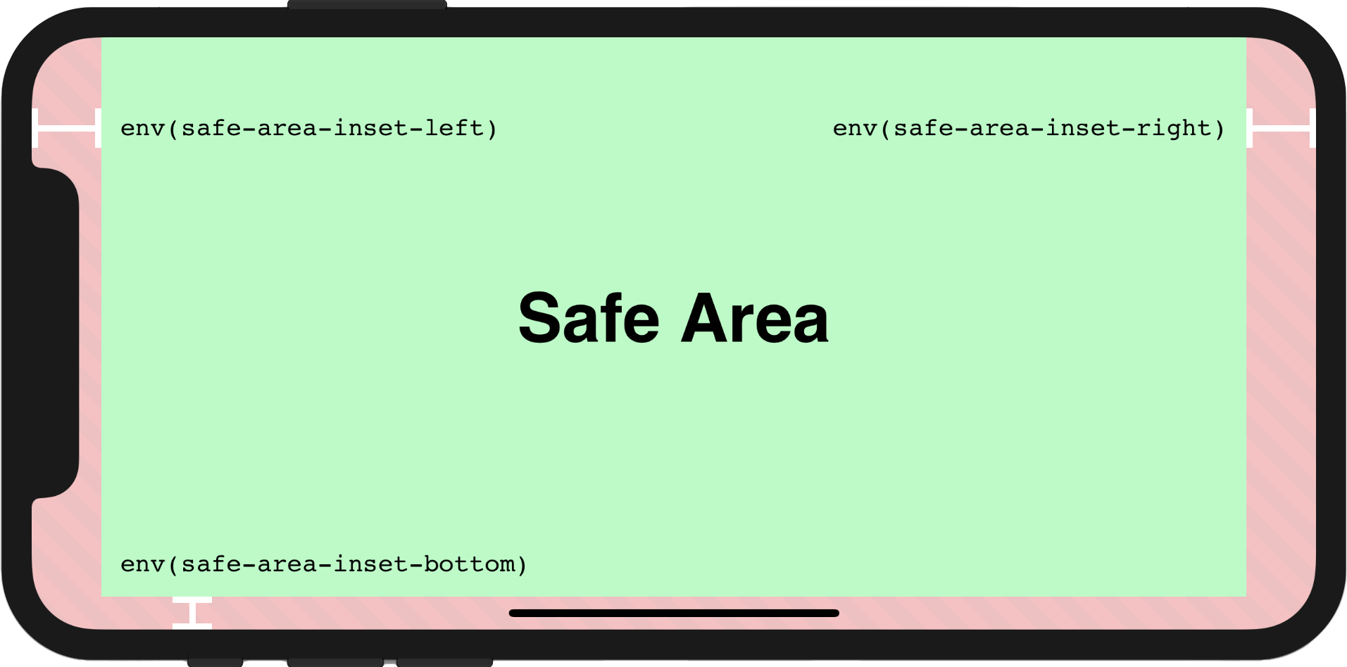
Reactive env(safe-area-inset-*)
Usage
In order to make the page to be fully rendered in the screen, the additional attribute viewport-fit=cover within viewport meta tag must be set firstly, the viewport meta tag may look like this:
<meta name="viewport" content="initial-scale=1, viewport-fit=cover" />
Then we could use useScreenSafeArea in the component as shown below:
import { useScreenSafeArea } from '@vueuse/core';

const { top, right, bottom, left } = useScreenSafeArea();
For further details, you may refer to this documentation: Designing Websites for iPhone X
Component Usage
<template>
  <UseScreenSafeArea top right bottom left> content </UseScreenSafeArea>
</template>
Type Declarations
/**
 * Reactive `env(safe-area-inset-*)`
 *
 * @see https://vueuse.org/useScreenSafeArea
 */
export declare function useScreenSafeArea(): {
  top: ShallowRef<string, string>;
  right: ShallowRef<string, string>;
  bottom: ShallowRef<string, string>;
  left: ShallowRef<string, string>;
  update: () => void;
};
export type UseScreenSafeAreaReturn = ReturnType<typeof useScreenSafeArea>;